disclaimer
This article is partially out of date, and the site has been remade using Nuxt rather than Jekyll.
If you'd like to read more, check out Moving to Nuxt.
I created my portfolio website around June 2020 to house both my work as a developer as well as any other little things that I wanted to show off or talk about.
It's built as a static Jekyll site and is hosted on Netlify, using Forestry for content population.
the design
I had a few main things in mind when I thought about how I wanted this site to look.
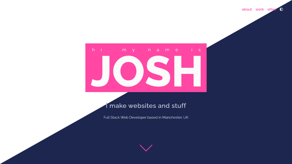
- I wanted it to be minimal
- I wanted it to have a fairly basic colour scheme
- I wanted it to have a big focus on typography
Minimality
My main motivation behind making the site minimal was that it was going to be holding text and not much else, so I didn't want to take much focus off of that with fancy layouts or flashy animations (at least not on the content pages).
Another benefit of minimalism is that it makes it really easy to make tight. I like to think that this site is built pretty well and looks good on most devices and screen sizes, which was made much easier by not having a million moving parts.
Colours
The colour scheme was largely inspired by a website I worked on at a previous job (which never ended up seeing the light of day, so it's mine for the taking 😊).
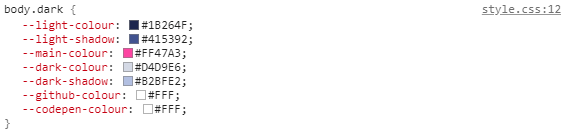
The original colour scheme I chose used two light colours, a main colour (pink), and two dark colours.
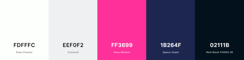
My original plan was to pick out the colours for both the default light theme and a dark theme from that palette. However, that idea ended up being a bit naff in practice, so I instead opted for two slightly different colour schemes for both light and dark.
This ended up working a lot better.
Typography
Since the main purpose of this site is to house text, I knew that I had to try to make the typography as nice as possible.
I started with finding a clean, readable font that I liked the look of (and was free, of course). This ended up being Raleway.
In order to make my longer articles of text easier to read, I decided to use a kinda large font size, increase the line-height to stop everything being squished together, and limit the width of the actual article so that it didn't span the whole page.
In addition, while writing I would use line breaks and paragraphs fairly liberally, mainly to try and prevent huge walls of text that are impossible to read.
the build
When I was first thinking about how to build this site I considered a few different options.
Originally I was going to build it as a regular PHP site using a CMS like Wordpress or CraftCMS, since I had a fair bit of experience building these kinds of things before.
However, not only would this mean I'd have to set up back end hosting which I couldn't be bothered doing, but I kinda wanted to try something new. So I canned that idea.
Next up I considered trying to use one of those fancy JS libraries like React or Vue, since I'd never really touched one before and they were all the rage.
Though after a bit of research I realised that I'd not only have to set up a back end for these libraries to query, but then actually write an API handler to get the information and display it. This sounded like entirely too much work.
Not only that, but importing a JS library (and subsequently forcing uses to have JS on) for a site that had nearly no interaction or moving parts doesn't really make much sense in my eyes. Maybe next time.
I finally landed on using a static site generator, since it didn't require me to set up a back end and spat out plain ol' static HTML files (which meant I could also host it for free 🤑).
I forget how exactly I stumbled on static site generators, most likely through a post/comment on the webdev subreddit. I also don't remember why I chose to use Jekyll over others, though in retrospect I would probably use something like Hugo or 11ty just for faster builds.
(Note to self: maybe don't wait a year before writing about what you made next time)
Actually building it
Since this site is so basic in terms of it's content, I could really focus in on trying to make the site as fast and lightweight as possible as well as supporting a few settings I perhaps wouldn't bother with normally.
A few examples of this would be:
- Lazy-loading all of the videos on the site, whilst also including a regular version in a <noscript> tag for users with JS turned off.
- Using a media property when importing certain styles to only load animations for users on a device with a mouse cursor and prefers-reduced-motion set to no-preference
- Automatically switching the site to dark mode for users with prefers-color-scheme set to dark (I'll go into this a bit more in a sec)
As well as this, thanks to some handy minification and compression, the initial load of the site's homepage doesn't go too far over 200kb. Meaning that regardless of whatever terrible internet connection you may be using, you should still be able to load the site fine (hopefully) (maybe).
At the time of building this site I had been developing sites for the NHS for a few years. This meant I had plenty of experience with developing for everyone's best pal Internet Explorer, since apparently it's the browser of choice for many in that organisation.
Unfortunately I don't particularly like Internet Explorer, and so decided to employ some wishful thinking and essentially forget it existed when building this site.
The main place that this came in handy was with implementing the aforementioned colour schemes into the site. Due to not having to worry about compatibility, I could use CSS variables for all of the colours on the site. This made implementing a dark mode a walk in the park.
Speaking of which...
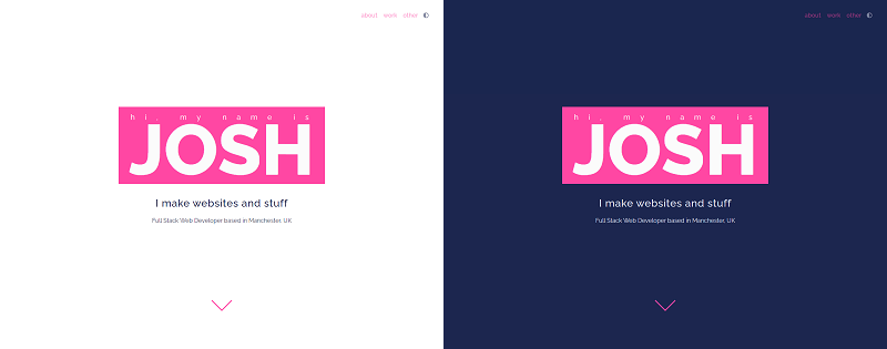
dark mode
Since it's pretty much the only moving part of this site it'd probably be worth talking about how this works.
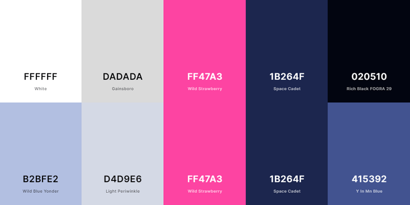
Like I mentioned before, I start by defining a couple of CSS variables which will hold the site's colours. Namely they are:
light-colour, light-shadow, main-colour, dark-colour, dark-shadow along with a few others for social links.
These names were defined with the light scheme in mind, as that was the colour scheme I initially built the site in. This meant that light-colour would be #FFFFFF, light-shadow would be #DADADA and so on.
To switch the site to the dark scheme, I can then just swap around all the variables but the main colour. So light-colour would switch from being the lightest colour to the darkest, dark-colour would become the lightest and so on.
This makes for some kinda funky reading if you look at Inspect Element while in dark mode, however it works well enough that I don't really care.
Next was actually allowing the user to switch between the modes.
Without Javascript
When you load the site the <body> has the class default applied to it. This class defines all the aforementioned variables as the light scheme at first, however this is overwritten with the dark scheme's colours if the prefers-color-scheme media query is set to dark.
This works pretty great in terms of it keeping the colour scheme that the user has set on their system, but makes it impossible (or at least a massive ball ache) to switch from one scheme to another.
With Javascript
To try and fix this problem, I could make a quick little Javascript switch that would swap the current colour scheme and save it in the user's cookies.
The main issue I faced when it came to this was setting the correct colour scheme when the user loaded a new page.
Since the site has no back end, I couldn't just add the correct class to the body there and have it render to the user's browser fine.
Similarly, trying to add this logic in an external <script> tag would mean the class would be added after the page load, which could cause a pretty ugly flash in some circumstances. I don't want to cause any seizures, so I needed to find a fix for this.
Luckily, there is a pretty simple solution for this. By placing this little bit of JS directly after the opening <body> tag:
const cookies = decodeURIComponent(document.cookie);const index = cookies.indexOf('darkMode');if(index !== -1){ document.querySelector('body').classList.remove('default'); document.querySelector('body').classList.add(['light', 'dark'][cookies.substr(index+9, 1)]);}else if(window.matchMedia('(prefers-color-scheme:dark)').matches){ document.querySelector('body').classList.add('dark');}I can block the rendering of the page until the correct class is added to the body, and therefore the right colour scheme is rendered. Usually render blocking is something that you would aim to avoid, however in this situation it is exactly what I need.
For what it's worth, the script above basically checks whether the user's preference is already saved in their cookies. If it is, it removes the default class from the body and applies the correct class for what the user saved.
Otherwise, it checks whether the user's device is already set to dark mode, then adds the dark class to the <body> if it is. This isn't to show the correct colour scheme (the CSS will already handle that), but is to make it so that if/when the user presses the switch it will work properly.
After this, all that's needed is a button that the user can click to switch between light and dark mode. The code for this is relatively simple, though there are a couple of small quirks to note:
document.querySelector('.colour-scheme-switch').addEventListener('click', () => { let classes = ['light', 'dark']; let value = (1 - document.querySelectorAll('body.dark').length); document.cookie = 'darkMode=' + value + ';path=/;'; document.querySelector('body').classList.add('transition'); setTimeout(() => { document.querySelector('body').classList.remove('transition'); }, 500); document.querySelector('body').classList.remove(classes[1 - value]); document.querySelector('body').classList.add(classes[value]);});Firstly, the way that I determine the darkMode cookie's value is more complicated than it looks.
Since the value of the cookie is binary (the site is either in dark mode or it isn't) I can just check whether the <body> tag has the class dark. If it does the length of the querySelector will be 1, otherwise it will be 0. I can then subtract that value from 1 to get the opposite value.
I then have to add then remove the transition class on the body to allow for a smooth transition between colour schemes. This class only contains one CSS definition:
body.transition { transition: background 0.5s, color 0.5s; }Which was originally added onto the body by default. However, I guess due to the different rendering engine treating the render blocking Javascript differently, this would cause the page to flash each time it loaded on Firefox.
Instead, adding this style to it's own class and then adding/removing said class when needed was an easy fix that worked all around.
Finally, I just add/remove the applicable classes to change the site's colour theme and hey presto the colour scheme has been swapped.
the future
This site is something that I always plan to keep iterating on as time goes on (so any part of this article may be incorrect/invalid at the time that you're reading it).
However, as of this article being written (July 2021, only over a year since I actually made the site 🤦♂️) everything here is near enough correct.
If you'd like to see the source code of this site, you can find it on Github.